As a Voynich Manuscript marginalia cognoscente, I’m always alert for new angles on the various incidental marks apparently added by its later owners. So, when Tim Tattrie left a comment about the “chicken scratch” marginalia on my recent Voynich-frontiers-circa-2010 post, I thought it was probably time to revisit them here.

Tim’s query was whether anyone had pursued the initials scribbled on f66v and f86v3: he noted that these were “clearly the same downward swept doodle of two or three letters (h?r), and because it is repeated in two folios, leads one to speculate its the initials of either the author, or an owner.” This almost exactly echoes what Jon Grove said on the Voynich mailing list (11 Sep 2002), that “It seems to consist of three connected downstrokes followed by a longer upstroke with a loop and final flourish, almost like ‘wR’ but not quite. It’s certainly not a random scribble. If it is a signature or monogram then it might help to establish dates and/or locations for the MS. ” To which Dana Scott replied at the time: “Notice that the single line ‘signature’ in f66v is essentially the same as the top line ‘signature’ in f86v (there are some differences to the right of each line).

OK, so let’s look at them in all their hi-res glory. Firstly, the chicken scratches on f66v:-

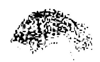
And now here are the chicken scratches on f86v3. Palaeographically, I think this is much more interesting, because you can see what looks like a scribal line ending stub (in red), and lots of places where the quill has opened up under pressure in different directions (in blue). Some years ago, I suggested that these scratches might be an ink blot transfer of Georg Baresch’s signature, because if you rotate and flip them you can see letter-sequences that vaguely resemble “g///g”:-

However, there is a codicological nicety to consider here, which is that if you reorder Q8 (Quire #8) to place the astronomical (non-herbal) pages at the back, and also follow Glen Claston’s suggestion by inserting the nine-rosette quire between (the reordered) Q8 and Q9, what you unexpectedly find is that the f66v and f86v3 chicken scratches move extremely close together. If this is correct, it would imply that the doodles were added very early on in the life of the VMs, probably earlier even than the fifteenth-century hand quire numbering (and hence probably early-to-mid 15th century). And this would rule out Baresch by a couple of centuries or so. 🙂

But I have a possible bombshell to drop here. If I once again rotate and reverse the f86v3 chicken scratch, this moves the ornate scribal line-ending to the start, implying that it was the start of a line. Following the lines through from there on a Retinex-enhanced version of the page, I now suspect we know enough to separate out the letters one at a time:

If I’ve got this correct, then the letter sequence here is:-

  • (blue) “S
  • (green) downstroke
  • (red) “i
  • (green) downstroke
  • (orange) “m
  • (green) downstroke
  • (purple) “o” / “n” / “t” [though it’s not entirely clear which]

So, something like “Simon”, then. What is particularly curious is that I have elsewhere suggested that the top-line marginalia on f116v reads “por le bon simon sint” in what I suspect was the handwriting of either the original author or someone very close to him/her. If that is right, then we can piece together a little bit of the VMs’ early 15th century provenance: that what we are looking at here is the ink blot signature of someone named (something close to) “Simon Sint”, who was very possibly the person to whom that original author gave the manuscript. Though it’s hard to be sure, this person may well be the same one who added the earliest set of quire numbers (which I called “Quire Hand 1” in The Curse)… but we’ll leave that issue for another day, that’s probably quite enough wobbly inferences for one post! 🙂

OK, as explanations go it’s not 100% convincing as yet, but all the same it’s a pretty joined-up historical hypothesis that could (and indeed should) be codicologically tested, which is more than can be said about most speculative VMs theories. I’m pretty sold on the idea that this is telling us we should be looking for someone (possibly a monk) in Southern France / Savoy called something not too far from “Simon Sint” circa 1450, and that this is his signature (i.e. he cared so little about the VMs that he used it as blotting paper, shame on him). Jeez, how specific do I need to be? 🙂

While snooping around the (mostly empty) user subsites on Glen Claston’s Voynich Central, I came across a page by someone called Robin devoted solely to the Scorpio “Scorpion” page in the VMs. This has an unusual drawing of a scorpion (or salamander) at the centre, and which I agree demands closer attention…

Voynich Manuscript f73r, detail of scorpion/salamander at centre of Scorpio zodiac circle

My first observation is that, while the paint in the 8-pointed star is very probably original, the green paint on the animal below is very likely an example of what is known as a “heavy painter” layer, probably added later. But what lies beneath that?

Luckily, there exists a tool for (at least partially) removing colour from pictures, based on a “colour deconvolution” algorithm originally devised (I believe) by Voynich researcher Gabriel Landini, and implemented as a Photoshop plugin by Voynich researcher Jon Grove. And so the first thing I wanted to do was to run Jon’s plugin, which should be simple enough (you’d have thought, anyway).

However… having bought a new PC earlier in the year and lost my (admittedly ancient) Adobe Photoshop installation CD, Photoshop wasn’t an easy option. I also hadn’t yet re-installed Debabelizer Pro, another workhorse batch image processing programme from the beginning of time that I used to thrash to death when writing computer games. If not them, then what?

Well, like many people, I had the Gimp already installed, and so went looking for a <Photoshop .8bf plugin>-loading plugin for that: I found pspi and gimpuserfilter. However, the latter is only for Linux, while the former only handles a subset of .8bf files… apparently not including Jon Grove’s .8bf (I think he used the excellent FilterMeister to write it), because this didn’t work when I tried it.

For a pleasant change, Wikipedia now galloped to the rescue: it’s .8bf page suggested that Helicon Filter – a relatively little-known non-layered graphics app from the Ukraine – happily runs Photoshop plugins. I downloaded the free version, copied Jon Grove’s filter into the Plug-ins subdirectory, and it worked first time. Neat! Well… having said that, Helicon Filter is quite (ready: “very”) idiosyncratic, and does take a bit of getting used to: but once you get the gist, it does do the job well, and is pleasantly swift.

And so (finally!) back to that VMs scorpion. What does lie beneath?

Voynich manuscript f73r detail, but with the green paint removed

And no, I wasn’t particularly expecting to find a bright blue line and a row of six or seven dots along its body either. Let’s use Jon’s plugin to try to remove the blue as well (and why not?):-

Voynich Manuscript f73r central detail, green and blue removed

Well, although this is admittedly not a hugely exact process, it looks to me to be the case that the row of dots was in the original drawing. Several of the other zodiac pictures (Gemini, Leo, Virgo, Libra, Sagittarius) have what appears to be rather ‘raggedy’ blue paint, so it would be consistent if Scorpio had originally had a little bit of blue paint too, later overpainted by the heavy green paint.

And so my best guess is that the original picture was (like the others I listed above) fairly plain with just a light bit of raggedy blue paint added, and with a row of six or seven dots along its body. But what do the dots mean?

I strongly suspect that these dots represent a line of stars in the constellation of Scorpio. Pulling a handy copy of Peter Whitfield’s (1995) “The Mapping of the Heavens” down from my bookshelf, a couple of quick parallels present themselves. Firstly, in the image of Scorpio in Gallucci’s Theatrum Mundi (1588) on p.74 of Whitfield, there’s a nice clear row of six or seven stars. Also, p.44 has a picture of Bede’s “widely-used” De Signis Coeli (MS Laud 644, f.8v), in which Scorpio’s scorpion has 4 stars running in a line down its back: while p.45 has an image from a late Latin version of the Ptolemy’s Almagest (BL Arundel MS 66, circa 1490, f.41) which also has a line of stars running down the scorpion’s back. A Scorpio scorpion copied from a 14th century manuscript by astrologer Andalo di Negro (BL MS Add. 23770, circa 1500, f.17v) similarly has a line of stars running down its spine.

In short, in all the years that we’ve been looking at the iconographic matches for the drawings at the centre of these zodiac diagrams, should we have instead been looking for steganographic matches for constellations of dots hidden in them?

Incidentally, another interesting thing about the Scorpio/Sagittarius folio is that the scribe changed his/her quill halfway through: which lets us reconstruct the order in which the text in those two pages was written.

Firstly, the circular rings of text and the nymphs were drawn for both the Scorpio and Sagittarius pages. The scribe then returned to the Scorpio page, and started adding the nymph labels for the two inner rings, (probably) going clockwise around from the 12 o’clock mark, filling in the labels for both circular rows of nymphs as he/she went. (Mysteriously, the scribe also added breasts to the nymphs during this second run). Then, when the quill was changed at around the 3 o’clock mark, the scribe carried on going, as you can see from the following image:-

Voynich manuscript f73r, label details (just to the right of centre)

What does all this mean? I don’t know for sure: but it’s nice to have even a moderate idea of how these pages were actually constructed, right? For what it’s worth, my guess is that these pages had a scribe #1 writing down the rings and the circular text first, before handing over to a scribe #2 to add the nymphs and stars: then, once those were drawn in, the pages were handed back to scribe #1 to add the labels (and, bizarrely, the breasts and probably some of the hair-styles too).

It’s a bit hard to explain why the author (who I suspect was also scribe #1) should have chosen this arrangement: the only sensible explanation I can think of is that perhaps there was a change in plan once scribe #1 saw the nymphs that had been drawn by scribe #2, and so decided to make them a little more elaborate. You have a better theory about this? Please feel free to tell us all! 🙂

Seeing the Voynich Manuscript for the first time is quite an intimidating experience: you’re looking at something which is so uncertain in so many different ways – how should you try to “read” it?

In general, when you look at a page of text, you do two different types of reading: (1) you work out how everything is laid out (you navigate the page) and (2) you read what is contained within it (you read the text). In computer science terms, you could describe the layout conventions and text conventions as having two quite separate ‘grammars’.

For instance, if you picked up a Hungarian newspaper, I would predict that you would stand a good chance of being able to work out its structure, even though you may not be able to understand a single word. It’s perfectly reasonable, then, to be able to navigate a page without being able to read it.

What’s not widely known about the Voynich Manuscript is that researchers have identified many of the navigational elements that structure the text (even though they cannot actually read them). I thought it might be helpful to post about these (oh, and I’m getting emails mildly berated me for posting too much about the wrong ‘v’, i.e. that it’s not “Vampire News).

As a practical example, let’s look at the very first page of the manuscript proper: this has the name “f1r” (which means “the recto [front] side of folio [double-sided page] #1″). You may also see this referred to as “f001r” (some people use this naming style so that their image files get sorted nicely), or even as “1006076.sid” (this is the Beinecke Rare Book & Manuscript Library’s internal database reference for the high-resolution scan of f1r, which they store as a kind of highly compressed image). This is what f1r looks like:-

Note that the green splodges aren’t actually part of the page itself – they’re green leaves painted onto the reverse side of the folio (that is, on f1v, “folio #1 verso [back]) that happen to be visible through the vellum. I’ll leave the issue of whether this is because the paint is too thick or the vellum is too thin to another day…

If we use a tricky colour filter written by Jon Grove (more on it here), we can make a passable attempt at removing the green splodges: and if we then bump up the contrast to make everything a little clearer, we can get a revised image of f1r:-


Red areas: these form the first four paragraphs of the text. These often start with one of four large vertical characters (known as “gallows characters”), and appear to have been written from top-left down to bottom-right, as you would English, French, Latin etc.

Blue areas: these are known as “titles”, and are typically right-aligned words or short phrases added to the end of paragraphs. It has been proposed that the text contained in these might actually be section titles (which seems fairly reasonable). There’s a brief discussion on this by (a differently spelled!) John Grove here, who first suggested the term.

Yellow area: this is a cipher key arranged vertically down the right hand side of the page that someone has written in (and only partially filled before giving up) in a 16th century hand. Though a bit indistinct, you can still make out “a b c d e” at the top left and a few other letters besides.

Bright green areas: these odd shapes appear nowhere else, and are generally referred to as “weirdoes” (for want of a better name). Interestingly, these are picked out in bright red: f67r2 is the only other place with red text that I can think of (the page that was originally on the front of what is now Quire 9).

Dull green area: this is where the earliest proven owner wrote his signature (something like “Jacobus de Tepenecz, Prag”, though it is very hard to make out), which a subsequent owner appears to have (quite literally) scrubbed off the page (if you look carefully, you can see what appears to be two or more watermarks at the edges of the area). The question of why someone would want to do this is a matter for another day…

Pink area: hidden in the top right corner next to some wormholes and the folio number (“1”, in a sixteenth century hand) is a very faint picture, possibly of a bird. Surprisingly, this subtle piece of marginalia doesn’t appear in GC’s otherwise-very-good gallery of Voynich marginalia: so here’s an enhanced picture of it so you can see what I’m talking about:-.

So, even if we can’t yet read f1r’s text, can we navigate its layout? I believe we can! From the presence of red text, I’m fairly certain it was the first page of a quire: and from the signature and weathering, I don’t see any reason to think this was ever bound anywhere apart from at the front of the manuscript. This leads me to predict that the set of four paragraphs forms an index to the manuscript as a whole, and so very probably describe four separate “books” or “works”, where the “title” (appended to the end of the paragraph) is indeed the title of that book.

If you were looking for cribs to crack the titles 🙂 , my best guess is that the first book (section) is a herbal, the second book is on the stars (astronomy and astrology), the third book is on water, while the fourth book comprises recipes and secrets. I also suspect that this index page was composed about three-quarters of the way through the project, and that the (really quite strange) Herbal-B pages were added in a subsequent phase. But, once again, that’s another story entirely…

I’ve spent a long time (though “far too long” probably covers it better) hunting down obscured fragments of text in the Voynich Manuscript: so my Spidey-sense tingled almost uncontrollably when I saw a claim for hidden text on f1v in the “Marginal Writing” picture gallery on Glen Claston’s Voynich Central.

I’d never heard of this before: just to be sure, I checked Reuben Ogburn’s 2004 page on “Writing in and around plant illustrations” in case it had slipped in there, but no sign. If you run this through Jon Grove’s colour separator filter, you can see that the brown ink used for the drawing and the brown paint used to fill it in are very slightly different: in the image below, the white area is where the filter thinks the overpainting happened.

But is there writing beneath? If you squint at the topmost image here long enough, you can start to make out something that might almost be writing. But if you filter it slightly differently, I think the answer emerges: the “signal” (below) appears to be not writing, but only compression artefacts from the MrSID wavelet encoding. Sorry, guys: false alarm! (Though next time I’m at the Beinecke, I’ll have another quick look, just to be completely sure…)