In Part 1, I tried to foreground everything you’d need to know about Quire 20 and BnF Lat 6741 in order to make it possible to try to systematically match their two respective recipe structures. I also tried to put my own thoughts and assessments to one side for this Part 2 post. So let’s get to work…
Visual Comparisons
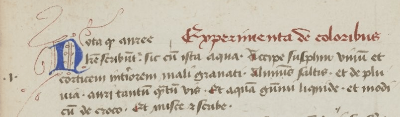
As we saw before, the recipe section in Lat 6741 starts with a marginal number and a scribal flourish.
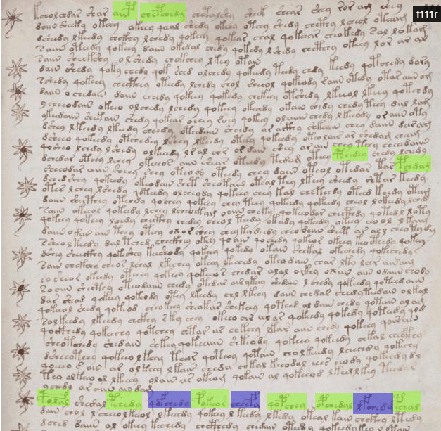
The start of (what I call) Q20B (on f105r, near the start of Q20) isn’t wildly different, visually speaking:
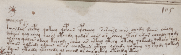
It has an extravagant-looking gallows initial character, and pretty much an identical number of lines. The “tailed star” is what I guess means “ytem”, a kind of medieval marginal ‘bullet point’, normally found within a list of items.
Moreover, it may just be a coincidence but the pair of single-leg gallows in the top line aligns strikingly well with the start of the red “Experimenta de coloribus” part of the Lat 6741 line.
It’s certainly easy to see why other people have previously suggested that what we are looking at in Q20 might well be a set of recipes, or possibly a set of 360 astrological predictions / prescriptions (as Tiltman suggested in 1975, mentioned in D’Imperio).
Horizontal Neal Keys?
Furthermore, this does make me wonder whether the top-line behaviour observed by Philip Neal (where we see pairs of single-leg gallows often appear two thirds of the way across the top line of a Q20 paragraph) might in fact be specifically mirroring structural behaviour we see often in Lat 6741. For example, its recipe #3 looks like this:
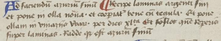
What we’re seeing here is a short recipe intro section (“ad faciendu[m] azuriu[m] finu[m]”), followed by an inserted coloured capital that precedes the body of the recipe. This basic pattern appears throughout Lat 6741’s recipes:
- coloured capital (red or blue)
- title
- coloured capital (blue or red)
- body
Compare this with the third paragraph of the Voynich Manuscript’s f105r:
Here we can see (if you ignore the “title” line inserted at the right hand side) a single-leg gallows at the start of the line, with more single-leg gallows (in fact, there are three of them) just about halfway through the paragraph’s top line.
Note, at this point I’m not claiming that what we’re seeing in the above is a translation or obfuscation or encryption of Lat 6741. However, I can’t help but suspect that what we are seeing here might well be structural parallels between the two documents (or, at least, between two classes of document).
Numbered recipes
One other aspect that strikingly emerged from the comparison was the numbering: the Arabic numerals Jehan le Begue’s used in his 1431 copy were a few decades ahead of the general adoption curve – and yet, because of the gaps in the numbering, it seems highly likely to me that these were gaps in the numbering present in Giovanni Alcherio’s original copy. All of which is why I suspect Alcherio’s original recipes were numbered (which I’m also guessing was why they appeared at the start of Jehan le Begue’s copy, so that le Begue could extend the numbered series into his own collection of recipes).
However, what I suspect we’re seeing in Quire 20 is (though I of course can’t prove it) more like an unnumbered list of “ytems”. Does that means we are looking at a completely different document? Or perhaps at a copied document where the marginal numbers were removed or lost in the copying? It’s hard to reason based on only a single text, however generous le Begue’s internal annotations were.
Materiality
My nextinferential jump is a little hard to explain, but it’s ultimately about materiality. Giovanni Alcherio was an illuminator, and asked lots of artists for their colour-making tricks, i.e. how to get best-in-class performance out of raw writing materials. Similarly, the way that the Voynich Manuscript’s vellum was prepared was (I think) very much trying to squeeze the best ‘performance’ out of not-quite-top-league support material, in a way that – to me – speaks of someone who also understood the nature of scribal material, and who considered it an important facet of production.
Putting these two together, I’m broadly quite liking the idea that Quire 20 may have contained scribal secret recipes of the sort that Alcherio and le Begue collected: that is, someone who cared about the quality of the support material must surely have also cared about the quality of the writing materials.
As an aside, a number of manuscript studies have applied modern spectroscopic analytical techniques to inks and paints to try to narrow down the precise recipes used (for example, both Nancy Turner and Ines Villela-Petit have done this). According to the Yale photographic facsimile edition of the Voynich Manuscript’s chapter on “Physical Findings”, the only blue pigment found was coarsely ground azurite with traces of red iron oxide (hematite, Fe2O3) and/or (as per McCrone) red cuprite (Cu2O), as well as (unusually) barium. Zyats et al (who wrote the chapter) suggest these “may be related to the geological origin of the azurite”, though the painstaking work of identifying where in the world this actually was was, umm, generously left as an area of “future research” for the reader. (pp. 34-36, plus footnotes)
(A quick Google search revealed that a Cornell group [Smieska et al] has been working on identifying the location of different azurites using the presence of barium and barites, but I don’t know how their work has advanced since 2016/2017.)
Which Metric(s) to Match?
Anyway, moving back to the block paradigm attack, which metrics should we consider collecting and comparing?
Though, as per Part 1, my first instinct was to compare [number of lines] in each recipe, I’m also now considering collecting and comparing [distance to first single-leg gallows] with [distance to first embedded coloured capital].
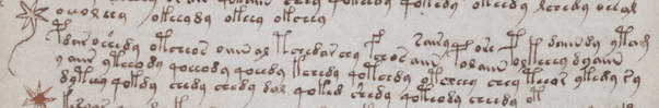
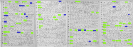
Incidentally, if you use voynichese.com as a quick way to highlight all words containing EVA f or EVA p on f111r (the page Rene Zandbergen highlighted as having many ‘probably fake’ paragraph stars), I think it makes it starkly clear why the top section there ‘reads’ so unlike the rest:
Here, even though the stars are almost all “tailed stars”, there’s a dearth of single-leg gallows as compared to the rest of Q20. If we broaden our viewpoint to include f108r, f108v, f111r and f111v (all on the same bifolio), I think you can clearly see the change in paragraph ‘tempo’ from the middle of f108v to the lower middle of f111r that I mentioned in Part 1, along with the fake-feeling area at the top of f111v:
As a different (more visual) ‘style’ of structure matching, it might therefore instead make sense to print out thumbnails of Lat 1641 and compare the above with patterns of coloured capitals, to see if the comparison reveals anything with the Q20 p/f word map on voynichese.com (printed out as per-folio thumbnails).
Interestingly, I should note that a strong structural match might imply the preservation of structure between documents even though the underlying text itself has been translated (never mind encrypted). That is, even if everything goes to plan here, we still might have no direct proof that the Voynichese is an encrypted version of the text in the other – the text itself may have been translated (e.g. to Italian or French) before being encrypted or obfuscated.
In that kind of case, though, it’s possible that the best route through would be to look for extremely distinctive words in the text (cribs) that would survive even translation and encryption. But let’s worry about such a theoretical problem only at such time as it becomes an actual problem. 😉
Nick,
There are precedents for use of a flower-like form to indicate itemised lists, and to separate sentences, but they’re not in the European tradition, where the ‘asteriskos’ took a different form.
I quoted various examples but those in a post of 2019 came from:
Bibliothèque nationale de France. Département des manuscrits. Arabe 2964, ,Kitāb al-Diryāq كتاب الدرياق. .(c.1290AD)
The custom may be older in some regions than the 7thC. I didn’t follow it back so far.
Nick,
The ‘Materials Science’ essay was very good, but doesn’t pretend to be a full account of the palette.
For instance, the passage about azurite begins “The only blue detected throughout the manuscript was…” but whether that means other blues weren’t found *throughout* the manuscript, or that there were no other blues to be seen anywhere i the ms. is left unclear. Overall. it seems from the authors’ specifying folio numbers, that certain small details, as representative of commonly-seen pigments were selected, and while that isn’t entirely clear from the report, it would be normal enough practice. The caption to Fig. 14 – analysis of the blue – refers to folio 102v-1.
We are still left with a marked gap between the number of pigments described in that essay and Carter’s description of the palette (as reported by d’Imperio). I’d love to see Zyats et.al. write up their lab work as a formal scientific paper for a Conservation journal. That would be grand and might help you with your explorations too.
the essay is entitled ‘Physical Findings’ for those without a copy.
So Nick, I would not want deter you from your “block paradigm idea” the overall theme of your ideas seem to be the Voynich being created to cover up “trade secrets” of some sort. First with Averlino, and now with Jehan la Begue, the ink maker, who I guess was a surrealist to the end of “hiding” his amazing ink recipes. Begue was a royal notary, so that would fit in, with the comparative example in Capelli.
One thing about it though is one of the plants I’m guessing Hugh Oneil’s “sunflower” really
really does look like a sunflower. I am aware DN disagrees. The biological section looks to be telling some sort of story as well, maybe a visit to the “underearth” as the pools of nymphs seems to wind exorably downward to a lake or ocean,as bizarre as this suggestion is likely to sound.
Out of curiosity my good friends, does anyone know if a copy of Mundus Subterranus by Kircher, in English, is or will be available. I am a also interested translation of hieriglyphical foray. I could read exp!anations of this, though I like to go to the source.
If you can prove your pardigm, great. It seems to go far beyond necessity however. Was there a mean war between inksmiths back then? Are there any equally bizarre works done in secret to compare it to? The weird hex at the end really? Don’t mess with an inkmaker!
So looking for structural and design similarities to another contemporary European scripts is the way to go? That didn’t pay off last 100 years.
The gallows at the beginning (???) of the small paragraphs in this section (sometimes with overstretched roof parts) serve one purpose: to deceive! And it seems to be so easy! They say: start to read here, is like in other medieval scripts too, isn’t it, we start with a first bombastic letter… don’t come up with the idea to read another way round
I think that quantities may have been retained.
Different places had different weights. Here, not only a translation would have to take place, but also a conversion.
Nor can I imagine that words like ounces. Lot and pint, or litre occur in the plant part. Here I rather see the description and which parts could be used. Perhaps also seasons.
Matt
Saying I ‘disagree’ suggests it’s a matter of opinion.
I appreciate that if a modern European or American looks at the image, their memory produces little but a ‘sunflower’ as comparison, but that’s quite a different matter from saying the first maker of the image had that intention.
If you set aside a personal and subjective impression and compare the drawing point-by-point with the form of a sunflower, or even with European drawings of the sunflower during the sixteenth and seventeenth centuries, there is no point on which these co-incide with the Voynich drawing, and nothing to spark the imagined comparison save a large ‘daisy-‘ like head, something characteristic of (literally) tens of thousands of plants in the family Asteraceae.
These are matters of verifiable fact, not opinion or subjective impression. The drawing does not “look like” a sunflower. What happens is that if you rely on whatever your memory throws up as comparison, it may well offer you ‘sunflower’, but to assert this the maker’s intention requires a more analytical approach.
A great deal of what is said about these drawings is predicated on an assumption that differences between the drawings and a theorist’s expectations are due to the draughtsman’s being deficient in some way. I’ll say again “normal” is not a synonym for “European”.
DN, one of the major barriers to understanding on this matter among Ciphermysteries followers perhaps is that the particular sunflower we are talking about is on 93r. People coming here with only a vague understanding of the Voynich perhaps think other folios in the manuscript may be the one we are discussing. This is not the folio that was listed as I believe “sunflowers” in the Illustrated Herbal book by Blunt and Raphael, that is far more vague looking.
It is 93r. It looks more or less like a garden variety sunflower, which I think you know. What this means is not clear to.me for the moment. Having a drawing of a sunflower in a radiocarbon dated manuscript with a date in the *early* 1400s is provocative to say the least. “In 1492, Christopher Columbus sailed the ocean blue” and discovered America is what we are taught. It seems either the discovery of America was earlier than we are told, or the dating may be off. Neither idea seems terribly palatable does it? From what I know of studying the vagaries of history, the Lost Colony, Jamestown, etc. Its more likely to be the former thats wrong. Unless, of course if someone used unused vellum at some time post Columbus.
Matt.
I know the folio you mean. It was worth a permanent page:
https://voynichrevisionist.com/a-short-and-wish-it-were-much-shorter-history-of-sunflowers-and-voynich-studies/
Diane: nice page!
Diane, yes for now we are going to have agree to disagree on it. MS408 has never been simple, and I doubt ever will be. I think it should be mentioned that sunflowers have a history of being first produced for industry in Russia, and there may be something there with it. I think I am the first to mention this idea for what its worth. I am trying to wrap my head around the idea that it could be a surrealist document from the late medieval as Nick is investigating.
I wish you and Nick and everyone else a lovely holiday season.
Thanks Nick.
In my post of September 3rd 2022 I mentioned Mount Etna as being a possible source of the palmierite and syngenite minerals. I meant Mount Vesuvius. I have always confused these two volcanoes.
Palmierite and syngenite are both rare minerals and the only known occurrences of this pair of minerals is the fumaroles associated with Mount Vesuvius.
I note that azurite is not a common mineral in Italy but it does occur in mineral deposits associated with Mount Vesuvius where it also occurs with bartyte (ie. Barium). Nick previously mentioned that research into identifying the source of azurite pigment was looking at using the barium contamination to identify the source so maybe these researchers might be prepared to look at the azurite used in the VM and compare it with azurite from Mount Vesuvius? Azurite from Mt Vesuvius has probably been used in other manuscripts so the work is not necessarily specific to the VM.
I note that cinnabar, the only red pigment known in the 15th Century, does not occur close to Mt Vesuvius and I note the lack of red colourants in the VM.
Byron, definitions of ‘red’ are not exactly subjective but neither are they uniform. Have you seen the ‘Physical Materials’ essay in the Yale facsimile edition?