Edith Sherwood, everyone’s favourite Leonardo-wrote-the-Voynich-so-he-did theorist, has posted up an extensive (and fascinating) new article focusing mainly on the depictions of the sun, moon and stars in the Voynich Manuscript: the starting point of her journey is the striking similarity between suns and moons in the VMs’ “astronomical” Quire 9 and a sun/moon pair on a particular Afro-Portuguese ivory horn (#101) carved between 1495 and 1521. Essentially, the question she tries to tackle is: what on earth connects these two very disparate objects?

afro-portuguese-horn-101
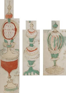
Afro-Portuguese Horn #101 (from Edith Sherwood’s site)

Unsurprisingly, she starts by linking the sun with the Visconti raza symbol (as per p.61 of my “The Curse of the Voynich”): but, even better, continues by connecting the sun/moon pair to two copies of Dante’s Commedia, as posted up by long-time Tarot researcher Robert V. O’Neill in Chapter 14 of his online article “Dante’s Commedia and the Tarot”.  O’Neill suggests connections between the Commedia manuscript illustrations (Sherwood describes these as 14th century “woodcuts”, probably a typo) and the designs found on early Tarot cards, in particular his Figure 37 (“late 14th century”) and Figure 39 (“mid 14th century”), though unfortunately he doesn’t give MS references for them. To all of which I would also add the probable connection between the circular arrays of VMs zodiac nymphs and Dante’s description of concentric rows of angels in Heaven (as per pp.36-37 of “The Curse”).

At first glance, Sherwood’s proposed iconographic connection between the Visconti-Sforza Tarot sun/moon, the carved ivory sun/moon, and the VMs sun/moon (essentially, though the carved ivory and the VMs were unlikely to be directly connected, they both had the Visconti-Sforza Tarot as a shared ancestor) seems perfectly reasonable. In fact, it almost amounts to an excellent example of the kind of “Voynich Research 2.0” 14th-century-centred art history I blogged about recently.

commedia-links

The problem with this is that it presupposes  a circa 1500 (basically, Leonardo-friendly) date for the VMs, without noting that there is an alternative  (and, given the 15th century quire numbers, I would say more likely) diffusion sequence that doesn’t rely on the Tarot at all. Remember, the similarities noted were between the VMs and the Commedia illustrations, not the Visconti-Sforza Tarot per se:-

commedia-links-v2

In her article, Edith Sherwood also makes a number of other fascinating observations and comparisons (to do with Apollo, with the water nymphs, and with the parallel hatching) which I’d really like to blog about in more detail, but quite frankly those will have to wait for another day.

Finally, Leonardo was anything but a child when he reached Milan in 1481 (when Sherwood suggests he probably first saw the Tarot), so her parallel claim that Leonardo can only have made the VMs as a (brilliant) child doesn’t really seem to stack up with her proposed Tarot connection anyway.

If you look at the VMs with truly open art historical eyes (as Sherwood set out to do), I think you will almost inevitably reach a certain position: it’s mid-Quattrocento Northern Italian, with its cryptographic roots in Milan, its intellectual roots in Florence, its stylistic roots in Venice, and its philosophical roots in Dante. Oh, and it was written by a secrets-obsessed right-hander with a far greater command of cryptography than Leonardo da Vinci ever had (Chapter 6 of “The Curse” has a detailed critique of Leonardo’s limited cryptography).

PS: I found Sherwood’s article through Google Adwords “Voynich written by a lefty?“: but if you want me to look at your Voynich site, please just email a link to me, it’s much cheaper (and quicker). 🙂

My last post on Elmar Vogt’s new blog received a comment from infinitii, asking me for the source for the suggestion that the zodiac motifs may have been copied from a (possibly 14th century) German woodcut calendar. I had long forgotten the story’s origin, but a quick grep through the VMs mailing list archives (the ones before 2002 that aren’t yet on the web) turned up what seems to be the key thread.

Jorge Stolfi began (29Dec2000):-

In the meantime, I remembered I had seen something like the VMS Sagittarius somewhere in the astrological books. And I have found it on the Web – have a look at:

  http://www.englib.cornell.edu/mhh4/planets/jupiter.html

This is from an early (15th c.) German “Planets’ Children” blockbooks (the planets’ children theme was also found in some of the Books of Hours – eg. the most beautiful one of Duc de Berry). The crossbow man looks *very much* like the VMS Sagittarius to me. Also note that the actual Sagittarius in a small circle at the feet of Jupiter above is represented as a man – not a traditional centaur (even though he holds a standard bow).

I think this confirms the 15th c. German origin as stated by Panofsky (a great authority, after all) – at least until a better argument is put forward (I am not convinced by the humanist hand argument and still less by the other Italian origin arguments recently presented by Dana – people were coming to study in Italy from all over Europe and thus
were heavily influenced by Renaissance culture and art).

Rene Zandbergen then replied (30Dec2000) to the last two paragraphs:-

Yes, very ‘block book’ and very German. In Saxl’s ‘Verzeichniss’ other nice examples can be seen.

I’m not yet ready to decide. Is the theme German and the execution Italian? Or in the block book, where the execution is German, the theme of the planets’ children was widespread. The profusely illustrated but otherwise only moderately useful book ‘Alchemie & Mystik’ by Alexander Roob gives a lot of nice examples.

Jorge Stolfi continued (30Dec2000):-

What I meant is that the crossbow man really looks like the VMS Sagittarius and that I have not seen that sign represented by a man rather than a centaur elsewhere. Are there any examples of non-German non-centaur Sagittarius?

Rene Zandbergen responded (30Dec2000):-

He does indeed. I found out I have copies of some illustrations from the same block book (in German) but these are not including Sagittarius.

Certainly, there are German Sagitarii which _are_ centaurs, but that doesn’t really help. I’ll scan a few nice images from a book called ‘Flores Albumasaris’ printed in Augsburg around 1480. They’re woodcuts but allow a nice comparison with some of the VMs images. Sagittarius is a Centaur here.

Then there’s a brief lull, until Rafal Prinke continues the thread (09 Jan 2001) with a number of closely related art historical bombshells:-

I have received a very kind and informative reply from Prof. Ewa Sniezynska-Stolot of the Jagiellonian University in Cracow (my repeated apologies to the list I had not written to her earlier). Below is a translation/summary of her letter.

——————————–

I have inspected the VMS at Beinecke. The signs of the Zodiac do not present problems – they are simply not of the Arateia type but were modernized. As I wrote in my books, because of linguistic mistakes and changes in artistic styles, human figures were represented in contemporary garments (viz. Gemini, Virgo, Sagittarius). Attributes were changed in the same way, eg. Sagittarius’ bow developed into a crossbow in the 15th c.

The genre scenes, eg. Aries eating a bush, suggest that the signs were redrawn from a calendar. Garments: the jopulas [?] of men with a belt suggest the 14th/15th c. but headdresses of men (Gemini, Sagittarius) definitively indicate the 15th c. This was common fashion in Europe at that time. The Sagittarius’ cap with fox tail points to Germany – but they were also worn in Poland. I believe that the manuscript can be dated
to mid-15th c. From the astrological iconography point of view, the Taurus at a well is somewhat strange – unless an image of donkeys was a basis for it and then it would refer
to Cancer – but that is certainly going too far.

In my opinion it is a notebook of a liberal arts student. Similar notebooks are Beinecke 225 and 226. The former belonged to Paul de Worczin who studied in Cracow in 1422
(according to the Beinecke catalogue Cracow is in Bohemia!). The latter is also from Cracow.

In our Institute we have a database with descriptions of most of existing medieval zodiacal iconography. I am now preparing a similar database of the iconography of
individual degrees of the Zodiac.

————————————–

Thus she confirms the opinion of Panofsky (and my own amateurish feeling) that the VMS should be dated to mid-15th Germany/Poland/Bohemia.

The suggestion that it is a student’s notebook is a bit of a revelation to me! Drawing naked ladies and fantastic pipelines during boring lectures is perhaps what they were doing from the dawn of time.

Prof. Sniezynska-Stolot has not addressed the VMS script but I hope to keep in contact with her. Maybe that was some kind of a medieval “beta-kappa” students’ corporation fun popular in Cracow and there are loads of similar manuscripts at the Jagiellonian Library?

Here’s a picture of a [modern] jopula (no, I didn’t know what it was either): basically, it’s a 14th/15th century outer garment made of four pieces plus sleeves, something like a doublet. Looks quite snug! 🙂

Rene Zandbergen picked up on the Sagittarius crossbowman’s hat’s fox tails (11Jan2001):-

Brumbaugh always made a point of stressing that this was a Florentine archer’s hat. Guess in whose opinion I put more trust.

Rafal Prinke then made a related calendaric aside (13Jan2001):

There were 3 styles of beginning the year in March:

1) Venetian – 1st March
2) Florentine and Pisan – 25th March (with a year’s difference)
3) Gallic – Easter Sunday (ie. not always in March)

The Venetian style was also used in Ruthenia (but not in Poland, which used exclusively Christmas and 1st January, along with Germany, Bohemia and Sweden). Russia changed to the Byzantine style in 1492 (1st September), also used in other Orthodox countries and in southern Italy.

The Florentine style was used in England, while the Gallic style – in France and the Netherlands.

So – if we accept the calendaric basis for the VMS Zodiac, it points either to Venice (and thus Northern Italy, which is the favoured hypothesis now) or pre-1492 Ruthenia, which might suggest further possibilities of a connection with Cyrillic, Greek, Georgian, Armenian or Turkish influences on the VMS script and content.

Incidentally, I should also flag this as a good example of how a single small thread in the VMs mailing circa 2000 typically contained more effort, historical research, genuine collaboration and reflective thought than entire months of postings there do now. People sometimes think that I’m perhaps being nostalgic or unrealistic when I talk of the decline of the list: but sadly it’s a very real phenomenon.

One of the better APOD posts I mentioned recently discussed the similarities between f67r1 and pages 10v and 19v of a 10th-11th century antiphonal, which can be seen in “Illuminated Manuscripts of Medieval Spain” by Mireille Mentré. This is held in León Cathedral library as its MS 8: I found a good quality image of 10v on a 2006 post on the Dragon’s Scriptorium blog by someone called Emma. León MS 8 is pretty (in fact, very pretty): but I’d need to see the rest of the manuscript to work out how good a match it is to the VMs.
There is also a nice picture of the circular design at Arcos de la Frontera on the Associacion Torrestrella blog, which dates it as no later than the fifteenth century. But I’d have to say it’s not an obvious match for f67r1.
Moving from Spain to Italy, and there are also plenty of geometric circular designs in Italian churches: a nice one from the floor of St Mark’s Basilica in Venice is at the bottom of this page from quilt artist Linda M. Poole.

But there is one of these which I can’t find anywhere, which I think I caught a glimpse of in “Francesco’s Venice” on TV: it was in the floor of the entrance of the Marciana in Venice (and so would have been made by Jacopo Sansovino). As I recall, this was almost exactly the same shape as the circular drawing in f67r1 (though without the face in the middle). But I have been unable to find a copy of it… drat! 🙁 [please email me if you find one!]

Back in 1991, sardonic linguist Jacques Guy concocted a deliberately false theory about the Voynich, “to demonstrate how the absurd can be dressed in sensible garb“. His “Chinese Hypothesis” had Marco Polo bringing back two Chinese scholars to Venice, who wrote down their encyclopaedic knowledge into a book in some semi-improvised European script… you guessed it, Voynichese. He never believed his pet canard for a moment: it was a rhetorical gesture to the interpretative folly – which I call “the curse” – that surrounds the study of the manuscript.

But then in 1997, Brazilian computer science professor Jorge Stolfi pointed out that, actually, Voynichese as transcribed does share a lot of statistical properties with Mandarin Chinese texts. Though technically true, the problem is not its stats, but rather that the Voynich Manuscript is (with very little doubt) a fifteenth century European cultural artefact. Stats only indicate correlation, not causation: so all Stolfi’s results really say is that the Voynich Manuscript transcription correlates moderately well with certain Mandarin Chinese transcriptions. But lifting the abstracted text out of its codicological and stylistical contexts can easily give rise to the kind of plucking fallacy Gordon Rugg’s work suffers from. Is the statistical similarity Stolfi found in the texts themselves, or in the methodology used to design the two transcriptions? I suspect it may well be the latter: the map is not the territory.

So why am I so fascinated by the news that some indecipherable Chinese texts have recently been found? They don’t look anything like Voynichese (and why should they?): but they do look like a pictographic script not entirely dissimilar to Chinese. Their finder, 38-year-old Zhou Yongle, suspects they might be written by the Tujia, a large ethnic minority in mainland China which has a spoken language but (as far as anyone knew) no written one. For what it’s worth, Wikipedia asserts that Tujia is a Tibeto-Burman language with some similarities to Yi: but – come on – you’d have to be a pretty h4rdc0re linguist to know or care what that means.

No: what I find intriguing is that these texts do look precisely like the kind of cultural artefacts you would expect, with (real) Chinese annotations and marginalia. If Jacques wants a proper historical linguistic puzzle to get his teeth into, then this would surely be exactly the right kind of thing for him: honestly, where’s the fun in devising a Sokal-like hoax at self-mystificating Voynichologists, when they’re already more than capable of tying themselves in knots over essentially nothing?

Of course, we mustn’t forget the possibility that Zhou Yongle may (for whatever reason) have faked these unreadable documents. You may not have heard of the huge “paper tiger” scandal in China recently over photos of the South Chinese Tiger, believed to have been faked by hunter Zhou Zhenglong; or indeed the whole issue of the 1421 (1418/1763) map hoaxery, as ably deconstructed by Geoff Wade et al. Were all three simply ‘Made In China’? It’s a good question…

The best academic stories normally begin something like “I was chatting with [name-drop] in the bar/taxi/plane/train after the conference when…“: so I’ll do my best to shoehorn the following into that template…

After Day One of the Warwick/Warburg “Resources and Techniques” seminars in Warwick, I ended up standing in the aisle of a packed Virgin Pendolino train all the way to London, in the company of two fellow course participants (Zoe Willis and Charlotte Bolland) and Francois Quiviger, one of the course lecturers from the Warburg Institute. Francois knew little about the Voynich Manuscript, but was interested enough to take a look at the pictures in Jean-Claude Gawsewitch’s “Le Code Voynich“, the (how can I put it any other way?) French coffee-table edition of the VMs. (And yes, I was carrying a copy in my bag: as with all things Voynichian, you make your own luck.)

Francois very kindly suggested a number of things I might consider: for example, when looking at the pharma section, he immediately asked if the idea that the ornate “jars” might be optical instruments (such as unknown kinds of telescopes) had been considered (it has, of course). He also wondered about the apparent resemblance between some of the (apparently) fantastical glass objects in the VMs’ pharmacological section and the monstrance, a word so beautifully obscure I simply had to look up on my return…

From the dawn of Christianity onwards, many churches owned (or claimed to own) holy relics: bones or teeth of saints, ephemera linked with miracles, nails or fragments from the One True Cross, Christ’s baby teeth, even the Holy Foreskin (yes, really: there’s a fascinating 2006 article from Slate here about its modern history), and so on. (Coincidentally, Michael Cordy’s novel “The Messiah Code” which I mentioned here name-checks many of these still-existent objects of veneration.)

Quite reasonably, many historians now wonder whether many of these were simply medieval money-making scams for attracting pilgrims and parting them from their money: Internet hype, circa 1250. But the pilgrim had to be able to see the relics whose claimed powers they had travelled so far to have contact with (in some cases literally – the blind could allegedly be cured by rubbing the Holy Foreskin on their eyelids, it says here): and therein lay the problem.

Right from the start, boxes or caskets containing relics needed to both protect the relic and to help make it accessible to pilgrims, as well as allowing the relic to be carried around on particular saint’s days: and so these reliquaries evolved into gaudy carrying-cases, sometimes fashioned in part from transparent rock crystal, thus solving all the problems. Technically, the precise term for a partly-transparent reliquary is a a philatory, but this is such an incredibly rare term that it is unlikely to help you much in your Googling: indeed, philatory will get you nowhere.

A monstrance, then, is a very specific kind of philatory, not for an ancient relic but for a special kind of relic that is recreated all the time – the consecrated Eucharistic Host. In Catholicism, the wafer and wine are believed quite literally to turn into Christ’s Body and Blood (the whole process is “transsubstantiation”), a real mini-miracle. Churches needed some affordable way of displaying the Host, of demonstrating the Real Presence of Christ to the assembled faithful: but how?

To solve this problem, someone invented circa 1475 the “monstrance”: a portable golden object, typically with a central “luna”, a circular glass area (for the transformed wafer to slip into for display) not unlike a pair of oversized glass specimen slides (modern monstrances are sometimes categorized by the diameter of the luna). And these remain in use today, with only cosmetic changes from this basic design.

Etymologically, monstrance comes from the same Latin roots from which we get “demonstrate”, and so retains its meaning of ‘showing something’: another obscure word (though one probably even less useful for Scrabble players) for the same object is ostensorium, which is presumably somehow linked with ostentatious.

What I find interesting in all this is that, just beneath the surface history, I can catch a glimpse of the kind of properly Warburgian history Francois Quiviger was talking about when he looked at the pharma section. From 1450 onwards, the invention and manufacture of beautifully-clear cristallo glass in Murano transformed the whole way objects such as philatories and monstrances were conceived: by breaking the need for (what was ludicrously expensive) rock crystal, cristallo made visibility an affordable design feature.

Could it be, then, that what we are seeing in this part of the VMs is not a set of purely fantasy glass objects, but possibly a kind of mangled brochure for a range of designs for cristallo-based philatories or monstrances, in the period at the end of the Quattrocento when the former was somehow seguing into the latter? 1475 is the earliest date I’ve seen quoted for a monstrance, but I would be unsurprised if the actual date of origination were to be found to be a little closer to 1450.

I couldn’t claim (by any stretch of the imagination) to be an expert on early modern reliquaries, philatories and monstrances (and how many such experts are there in the world, anyway?): but it’s an intriguing suggestion, one on which I’d be interested to hear any comments…

For over a year, I’ve been searching for a good Venetian document circa 1450-1460 that would illustrate the “parallel hatching” found in the Voynich Manuscript (particularly in the “nine rosette” map page). I knew there were examples out there, but hadn’t been able to find any.

Well: now I have…

A link from the always-interesting Daily Grail led to a November 2007 Science Mode article, which in turn led me to the American Geographical Society’s festival exhibition website, and from there to a reasonable-sized online scan of Giovanni Leardo’s 1452 mappamundi (made in Venice). Click on the four quadrants to see zoomed-in versions.

There’s much to be written on this, but for now, all I’ll say is: look at the rendering of the four prophets in the four corners, and compare them closely with the detailing on the nine rosette map page. Wonderful, fantastic, amazing – finding this made my heart miss a beat, perhaps it will excite you too…