Seeing the Voynich Manuscript for the first time is quite an intimidating experience: you’re looking at something which is so uncertain in so many different ways – how should you try to “read” it?

In general, when you look at a page of text, you do two different types of reading: (1) you work out how everything is laid out (you navigate the page) and (2) you read what is contained within it (you read the text). In computer science terms, you could describe the layout conventions and text conventions as having two quite separate ‘grammars’.

For instance, if you picked up a Hungarian newspaper, I would predict that you would stand a good chance of being able to work out its structure, even though you may not be able to understand a single word. It’s perfectly reasonable, then, to be able to navigate a page without being able to read it.

What’s not widely known about the Voynich Manuscript is that researchers have identified many of the navigational elements that structure the text (even though they cannot actually read them). I thought it might be helpful to post about these (oh, and I’m getting emails mildly berated me for posting too much about the wrong ‘v’, i.e. that it’s not “Vampire News).

As a practical example, let’s look at the very first page of the manuscript proper: this has the name “f1r” (which means “the recto [front] side of folio [double-sided page] #1″). You may also see this referred to as “f001r” (some people use this naming style so that their image files get sorted nicely), or even as “1006076.sid” (this is the Beinecke Rare Book & Manuscript Library’s internal database reference for the high-resolution scan of f1r, which they store as a kind of highly compressed image). This is what f1r looks like:-
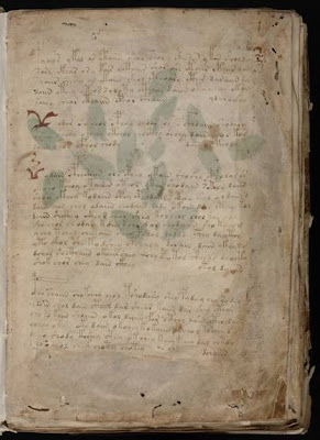
Note that the green splodges aren’t actually part of the page itself – they’re green leaves painted onto the reverse side of the folio (that is, on f1v, “folio #1 verso [back]) that happen to be visible through the vellum. I’ll leave the issue of whether this is because the paint is too thick or the vellum is too thin to another day…

If we use a tricky colour filter written by Jon Grove (more on it here), we can make a passable attempt at removing the green splodges: and if we then bump up the contrast to make everything a little clearer, we can get a revised image of f1r:-
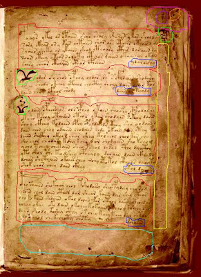

Red areas: these form the first four paragraphs of the text. These often start with one of four large vertical characters (known as “gallows characters”), and appear to have been written from top-left down to bottom-right, as you would English, French, Latin etc.

Blue areas: these are known as “titles”, and are typically right-aligned words or short phrases added to the end of paragraphs. It has been proposed that the text contained in these might actually be section titles (which seems fairly reasonable). There’s a brief discussion on this by (a differently spelled!) John Grove here, who first suggested the term.

Yellow area: this is a cipher key arranged vertically down the right hand side of the page that someone has written in (and only partially filled before giving up) in a 16th century hand. Though a bit indistinct, you can still make out “a b c d e” at the top left and a few other letters besides.

Bright green areas: these odd shapes appear nowhere else, and are generally referred to as “weirdoes” (for want of a better name). Interestingly, these are picked out in bright red: f67r2 is the only other place with red text that I can think of (the page that was originally on the front of what is now Quire 9).

Dull green area: this is where the earliest proven owner wrote his signature (something like “Jacobus de Tepenecz, Prag”, though it is very hard to make out), which a subsequent owner appears to have (quite literally) scrubbed off the page (if you look carefully, you can see what appears to be two or more watermarks at the edges of the area). The question of why someone would want to do this is a matter for another day…

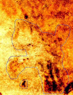
Pink area: hidden in the top right corner next to some wormholes and the folio number (“1”, in a sixteenth century hand) is a very faint picture, possibly of a bird. Surprisingly, this subtle piece of marginalia doesn’t appear in GC’s otherwise-very-good gallery of Voynich marginalia: so here’s an enhanced picture of it so you can see what I’m talking about:-.

So, even if we can’t yet read f1r’s text, can we navigate its layout? I believe we can! From the presence of red text, I’m fairly certain it was the first page of a quire: and from the signature and weathering, I don’t see any reason to think this was ever bound anywhere apart from at the front of the manuscript. This leads me to predict that the set of four paragraphs forms an index to the manuscript as a whole, and so very probably describe four separate “books” or “works”, where the “title” (appended to the end of the paragraph) is indeed the title of that book.

If you were looking for cribs to crack the titles 🙂 , my best guess is that the first book (section) is a herbal, the second book is on the stars (astronomy and astrology), the third book is on water, while the fourth book comprises recipes and secrets. I also suspect that this index page was composed about three-quarters of the way through the project, and that the (really quite strange) Herbal-B pages were added in a subsequent phase. But, once again, that’s another story entirely…
I’ve been reading up on the pre-history of the telescope recently (hence my reviews of Eileen Reeves’ Galileo’s Glassworks and Albert van Helden’s The Invention of the Telescope), but have omitted to mention why I thought this might be of relevance to the Voynich Manuscript.

The answer relates to Richard SantaColoma’s article in Renaissance Magazine #53 (March 2007) with the title “The Voynich Manuscript: Drebbel’s Lost Notebook?”, which claimed to find a persuasive familial similarity between the curious jars arranged vertically in the pharma sections and Renaissance microscopes, specifically those described or designed by Cornelius Drebbel. His (updated) research also appears here.

The biggest problem with Voynich hypotheses is that, given 200+ pages of interesting stuff, it is comparatively easy to dig up historical evidence that appears to show some kind of correlation. In the case SantaColoma’s webpage, this category covers the stars, the hands, braids, caps, colours, four elements, Francis Bacon’s New Atlantis and handwriting matches suggested: none of these is causative, and the level of correlation is really quite low. All of which is still perfectly OK, as these parallels are only presented as suggestive evidence, not as any kind of direct proof.

It is also tempting to use a given hypothesis to try to support itself: in the 1920s, William Romaine Newbold famously did this with his own circular hypothesis, where he said that the only way that the manuscript’s microscopic cipher could have been written was with the aid of a microscope, ergo Roger Bacon must have invented the microscope. All false, of course. Into this second category falls the “cheese mold”, “diatoms” and “cilia” of SantaColoma’s webpage: if these are to used as definitive proof of the presence of microscopy in the VMs, the level of correlation would need to be substantially higher. But these parallels are, once again, only presented as suggestive evidence, not proof.

Strip all these away, and you’re still left with the real meat of SantaColoma’s case: a set of striking similarities between 17th century microscopes and the curious devices in the Voynich Manuscript’s pharma section. Even if (as I do) you doubt that all the colouring on the pages was original (and upon which some of SantaColoma’s argument seems to rest), it’s an interesting observation.

Having said that, no actual proof or means of proof (or disproof) is offered: it is just a set of observations, resting upon a relatively little-tested tranche of history, that of the microscope. Can we do better? I think we can.

Firstly, modern telescope historians (I’m thinking of Albert van Helden here, though he is far from alone in this respect) now seem somewhat dubious of the various Janssen family claims: and so I’m far from comfortable with placing the likely birth of the microscope with the Janssens in 1590. As Richard SantaColoma points out, Cornelius Drebbel is definitely one of the earliest documented microscope makers (from perhaps a little earlier than 1620, but probably not much before 1612, I would guess).

Secondly, it is likely that the power of the lenses available for spectacles pre-1600 was not great: Albert van Helden calculated that a telescope made to della Porta’s (admittedly cryptic) specification could only have given a magnification of around 2x, which would be no more than a telescopic toy. I would somewhat surprised if microscopes constructed from the same basic components had significantly higher magnification.

Thirdly, the claimed presence of knurled edges in the VMs’ images would only make sense if used in conjunction with a fine screwthread, to enable the vertical position of an element along the optical axis to be varied: but I’m not sure when these were invented or adapted for microscopes.

All in all, I would assert that if what is being depicted in the VMs’ pharma section is indeed microscopes from the same family as were built by Drebbel from (say) 1610 onwards, there would seem no obvious grounds for dating this to significantly earlier than 1610: even if it all came directly from Della Porta, around 1589 would seem to be the earliest tenable date.

The problem is that there is plenty of art historical data which places the VMs circa 1450-1500: and a century-long leap would seem to be hard to support without more definitive evidence.

As always, there are plenty of Plan B hypotheses, each of which has its own unresolved issues:-
(a) they are microscropes/telescopes, but from an unknown 16th century inventor/tradition
(b) they are microscropes/telescopes, but from an unknown 15th century inventor/tradition
(c) they’re not microscopes/telescopes, they just happen to look a bit like them
(d) they’re not microscopes/telescopes, but were later emended/coloured to look like them
(e) it’s all a Dee/Kelley hoax (John Dee was Thomas Digges’ guardian from the age of 13)

Despite everything I’ve read about the early history of the telescope and microscope, I really don’t think that we currently can resolve this whole issue (and certainly not with the degree of certainty that Richard SantaColoma suggests). The jury remains out.

But I can offer some observations based on what is in the Voynich Manuscript itself, and this might cast some light on the matter for those who are interested.

(1) The two pharma quires seem to be out of order: if you treat the ornate jars as part of a visual sequence, it seems probable that Q19 (Quire 19) originally came immediately before Q17 in the original binding.

(2) The same distinctive square “filler” motif appears in the astronomical section (f67r1, f67r2, f67v1), the zodiac section (Pisces, light Aries), the nine rosette page (central rosette), and in a band across the fifth ornate jar in Q19. This points not only to their sharing the same scribe, but also to a single (possibly even improvised) construction/design process: that is, the whole pharma section is not simply a tacked-on addition, it is an integral part of the manuscript.

(3) Some paint on the pharma jars appear original: but most seems to be a later addition. For example: on f99v, I could quite accept that the palette of (now-faded) paints used to colour in the plants and roots was original (and I would predict that a spectroscopic or Raman analysis would indicate that this was probably comprised solely of plant-based organic paints), which would be consistent with the faded original paint on the roots of f2v. However, I would think that the bolder (and, frankly, a little uglier) paints used on the same page were not original.

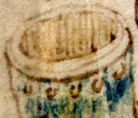
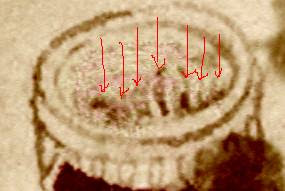
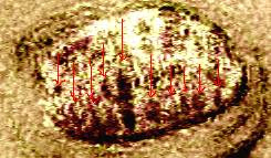
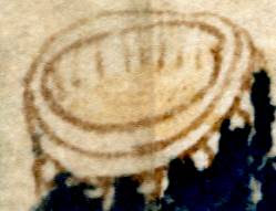
Put all these tiny fragments together, and I think this throws doubt on one key part of SantaColoma’s visual argument. He claims that the parallel hatching inside the ornate jar at the top of f88r (the very first jar in Q17) is a direct indication that it is a lens we are looking at, fixed within a vertical optical structure. However, if you place Q19 before Q17 (as I believe the original order to have been), then a different story emerges. The ten jars immediately before f88v (ie at the end of Q19) all have vertical parallel hatching inside their tops, none of which looks at all like the subtle lens-like shading to which SantaColoma is referring. For reference, I’ve reproduced the tops of the last four jars below, with the final two heavily image-enhanced to remove the heavy (I think later) overpainting that has obscured much of the finer detail.

This is the “mouth” of the top jar on f102r: the vertical parallel hatching seems to depict the back wall of a jar, ending in a pool of faintly-coloured yellow liquid (probably the original paint).


This is the mouth of the bottom jar on f102r, which appears to have vertical parallel hatching right down, as though the jar is empty near the top (or perhaps its contents are clear).


This is the top jar on 102v, enhanced to remove the paint. I think some vertical hatching is still visible there: it would take a closer examination to determine what was originally drawn there.

This is the bottom jar on f102v, again heavily enhanced to remove paint. Vertical hatching of some sort is visible.