Seeing the Voynich Manuscript for the first time is quite an intimidating experience: you’re looking at something which is so uncertain in so many different ways – how should you try to “read” it?
In general, when you look at a page of text, you do two different types of reading: (1) you work out how everything is laid out (you navigate the page) and (2) you read what is contained within it (you read the text). In computer science terms, you could describe the layout conventions and text conventions as having two quite separate ‘grammars’.
For instance, if you picked up a Hungarian newspaper, I would predict that you would stand a good chance of being able to work out its structure, even though you may not be able to understand a single word. It’s perfectly reasonable, then, to be able to navigate a page without being able to read it.
What’s not widely known about the Voynich Manuscript is that researchers have identified many of the navigational elements that structure the text (even though they cannot actually read them). I thought it might be helpful to post about these (oh, and I’m getting emails mildly berated me for posting too much about the wrong ‘v’, i.e. that it’s not “Vampire News“).
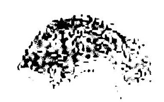
As a practical example, let’s look at the very first page of the manuscript proper: this has the name “f1r” (which means “the recto [front] side of folio [double-sided page] #1″). You may also see this referred to as “f001r” (some people use this naming style so that their image files get sorted nicely), or even as “1006076.sid” (this is the Beinecke Rare Book & Manuscript Library’s internal database reference for the high-resolution scan of f1r, which they store as a kind of highly compressed image). This is what f1r looks like:-
 Note that the green splodges aren’t actually part of the page itself – they’re green leaves painted onto the reverse side of the folio (that is, on f1v, “folio #1 verso [back]“) that happen to be visible through the vellum. I’ll leave the issue of whether this is because the paint is too thick or the vellum is too thin to another day…
If we use a tricky colour filter written by Jon Grove (more on it here), we can make a passable attempt at removing the green splodges: and if we then bump up the contrast to make everything a little clearer, we can get a revised image of f1r:-

Red areas: these form the first four paragraphs of the text. These often start with one of four large vertical characters (known as “gallows characters”), and appear to have been written from top-left down to bottom-right, as you would English, French, Latin etc.
Blue areas: these are known as “titles”, and are typically right-aligned words or short phrases added to the end of paragraphs. It has been proposed that the text contained in these might actually be section titles (which seems fairly reasonable). There’s a brief discussion on this by (a differently spelled!) John Grove here, who first suggested the term.
Yellow area: this is a cipher key arranged vertically down the right hand side of the page that someone has written in (and only partially filled before giving up) in a 16th century hand. Though a bit indistinct, you can still make out “a b c d e” at the top left and a few other letters besides.
Bright green areas: these odd shapes appear nowhere else, and are generally referred to as “weirdoes” (for want of a better name). Interestingly, these are picked out in bright red: f67r2 is the only other place with red text that I can think of (the page that was originally on the front of what is now Quire 9).
Dull green area: this is where the earliest proven owner wrote his signature (something like “Jacobus de Tepenecz, Prag”, though it is very hard to make out), which a subsequent owner appears to have (quite literally) scrubbed off the page (if you look carefully, you can see what appears to be two or more watermarks at the edges of the area). The question of why someone would want to do this is a matter for another day…
Pink area: hidden in the top right corner next to some wormholes and the folio number (“1”, in a sixteenth century hand) is a very faint picture, possibly of a bird. Surprisingly, this subtle piece of marginalia doesn’t appear in GC’s otherwise-very-good gallery of Voynich marginalia: so here’s an enhanced picture of it so you can see what I’m talking about:-.

So, even if we can’t yet read f1r’s text, can we navigate its layout? I believe we can! From the presence of red text, I’m fairly certain it was the first page of a quire: and from the signature and weathering, I don’t see any reason to think this was ever bound anywhere apart from at the front of the manuscript. This leads me to predict that the set of four paragraphs forms an index to the manuscript as a whole, and so very probably describe four separate “books” or “works”, where the “title” (appended to the end of the paragraph) is indeed the title of that book.
If you were looking for cribs to crack the titles 🙂 , my best guess is that the first book (section) is a herbal, the second book is on the stars (astronomy and astrology), the third book is on water, while the fourth book comprises recipes and secrets. I also suspect that this index page was composed about three-quarters of the way through the project, and that the (really quite strange) Herbal-B pages were added in a subsequent phase. But, once again, that’s another story entirely…