Here’s another post inspired by the book I’m currently reading, Joscelyn Godwin’s “The Pagan Dream of the Renaissance”.

Whereas 15th century Renaissance art was largely orderly, linear, a lot of Mannerist late 16th-century art is disorganized, curvilinear, riotous – this has led to the label of antirinascimento, the “Anti-Renaissance”. But to someone like Godwin with both feet in the iconological trenches, this speaks of a deeper dichotomy – between the ordered Apollonian meme and the disordered Dionysian meme. Godwin pitches the austere, Roman-loving Quattrocento humanists’ dry perspective against the carnal obsessions and pagan thematics of corrupted Cinquecento cardinals – an extended Apollo vs Dionysus grudge-match in an art historical arena.

All of which is quite cool, in an iconological sort of way. 🙂

But once you start looking at things in this way, you begin to see echoes everywhere: in my own research area of Quattrocento ciphers, you could view Alberti’s über-ordered cipher wheel as a quintessentially Apollonian solar device, and then compare it with the apparently disordered, fragmented Voynich manuscript cipher statistics (that I link with Antonio Averlino, AKA Filarete) – Roman austerity against Greek cunning.

Yet does this kind of dichotomistic model really give us a real insight into the kind of secret history that iconologists believe lurks just beneath? Or is it just a modern quasi-thermodynamic meta-narrative (historicizing the universe’s eternal battle of order vs disorder) being stamped over the top of something that is no more significant than a difference in personality?

Reading anything to do with iconography makes me feel like I’m watching a renegade episode of the X-Files, where Mulder and Scully are arguing the toss over something foolishly marginal. Though occasionally I have brief moments where I think “Yes, that does make sense”, you simply cannot infer from the existence of a debate that any of the mad theories being proposed has to be correct. Oh well!

Update: Dennis Stallings points out off-list that the Apollo vs Dionysus grudge-match as an art-historical thema only really kicked off with Nietzsche’s (1872) “The Birth of Tragedy”, which is entirely true – here’s a nice 1996 paper showing (basically) how you can use the A. vs D. dichotomy as a way of blagging your way through literature studies. 🙂
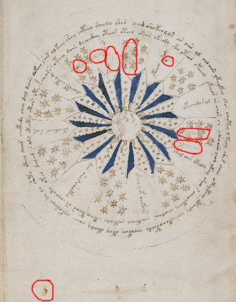
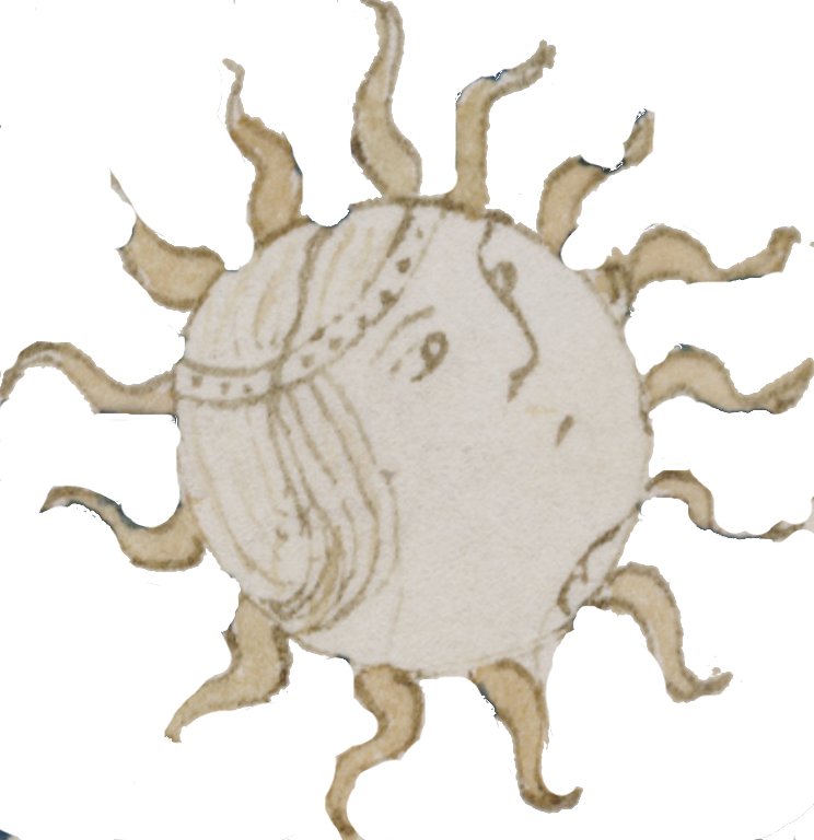
Edith Sherwood recently flagged the “sun-face” at the middle of f68v1 as being a representation of Apollo, and that this “could indicate an association with Roman mythology“. Certainly, the face is tilted slightly upward and is linked with the sun, both features you might (naively, iconologically) expect to point to Apollo. If only Voynich research was that simple! Let’s start by taking a look at the sun-face in context, in particular the paints….

f68v1-highlighted

Here, the red-coloured contact transfer (from f69r) at the bottom left clearly happened after the pages were rebound in the wrong order [f68v1’s “sun-face” initially sat beside f67r1’s “moon-face”], bringing to my mind the bloodstain imagined on the Sarajevo Haggadah by Geraldine Brooks in her novel “People of the Book” (which I’ll review here shortly). There are also “blue-edge” paint transfers (also from f69r) at 11.30, 12.00, 3.00, and 3.30, as well as some contact-transferred green “pipe-ends” at 10.30, 11, and 1 o’clock.

Given that the dirty black-blue paint on f68v1 appears to be identical to the one used on f69r, it seems extremely likely to me that the blue and green paints on both pages were later additions, whereas f68v1’s far paler yellow paint (which is covered over by the blue in a number of places) gives the distinct impression of being original. The ‘alpha’ (i.e. original) state of the page was therefore very likely to be just the drawings and the yellow paint only. If you snip away all the distracting blue paint in a a picture editor, you’d get something like this:-

sun-face-alpha

With all the distracting blue paint removed, we can start to see more clearly what was being drawn. For instance, we can see the lines marking the front and back of the neck: and once we see those, we can see the wobbly line marking the back of the head (inside the circle). However, this appears to me to go over the dotted “headband” – and so the headband was apparently drawn first.

There is also a curious small loop where the head’s left ear would be, partially disguised by the rays, which I find reminiscent of the kind of stubby metal loops you see on astrolabes.

I therefore argue that this codicological evidence suggests that the alpha state of the image was probably a circle with a dotted arc that has been made to look as though it is a headband (when a face was added) – and so I would say that any resemblance to Apollo is very probably incidental to the real meaning of the page.

Dotted lines seem to have a particular resonance for the VMs’ author in several other places, and I have long suggested that these might very well indicate that meaningful information has been visually encoded. My guess here is that this was the briefest of sketches to allude to some kind of 15th century solar instrument – not an astrolabe, but something broadly similar.

To me, all this exemplifies the problem with looking for iconographic matches on the VMs’ sleek surface: in most cases, the basic codicological study (that ought to precede any searching for meaning) seems not to have been done – far too often, people skip to the chase without really looking at the page first.

Oh well! 😮