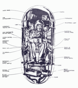
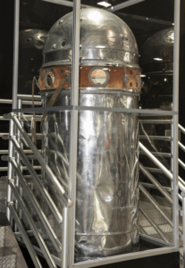
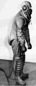
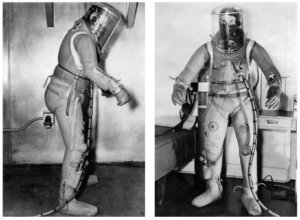
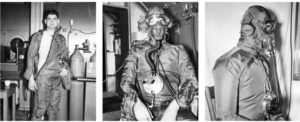
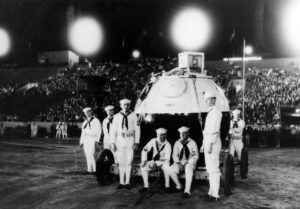
When airship-obsessive Vice Admiral Charles Rosendahl retired in November 1946, the US Navy looked around for a suitable successor to run NAS Lakehurst, the Navy’s top airship (and airship R&D) site. yet the person they appointed was perhaps a surprise to some. This was T. G. W. ‘Tex’ Settle, who – despite his obvious qualifications for the job – had left the airship side of the Navy some years before, complaining loudly about political infighting. The top role Settle now took on at Lakehurst was known as CNATE, and his immediate boss at the Office of Naval Research was Commander George Hoover. [Image from here, p.18, 1976]
Why is George Hoover relevant? Well… given that the capsule reportedly found at Roswell site #2 would have needed a huge balloon to lift, and that the only organisation that had made metalclad LTA (“Lighter Than Air”) in the preceding 25 years was the US Navy, I’ve been looking veeeerrrrry carefully at what Tex Settle was doing as CNATE in the first half of 1947. (Bad news: Settle hated paperwork, so the archives don’t have even 1% as much for him as for Charles Rosendahl, who kept it all, bless him.) This especially includes all the meetings relating to Jean Piccard’s Project Helios as it slowly fell apart during that period.
So, as a corollary, I was obviously also very interested in what Settle’s boss George Hoover was doing back then, and what he had to say or think about what was going on. (Though I wasn’t able to get a copy of the memoirs that he was composing when he retired, sadly). And so I was fascinated when I found a 2010 page on Anthony Bragalia’s website that describes what Hoover reportedly told researcher William J. Birnes about the Roswell Incident.
What Did He Say, What Did He Say?
Look, I’ll just cut [to the chase] and paste Bragalia’s bullet-points summarising what George Hoover told Birnes (and Hoover’s opinions on the subject, needless to say, are not mine, not at all):
- UFOs are not the “biggest secret” – it is the entities behind them that was of most concern
- Roswell was in fact a crash event of “visitors from somewhere else”
- The entities were “not so much interplanetary as much as they were literally also time travelers.” They are extra-temporal.
- The visitors are clearly “from the future.” There is reason to believe that they may even be “us” from a future Earth.
- These “future humans” have the ability to “manipulate reality around us”
- The government feared the intentions and abilities of the “visitors”
- These visitors are able to use the power of consciousness in extraordinary ways to morph reality
- We human beings are far more powerful in potential than we ever dreamed that we are. We don’t yet comprehend our extraordinary future capabilities.
- The visitors remain at essence, though “corporeal” and “physical” – and secret attempts at reverse-engineering the visitor’s crash material were made
- Incredibly, Hoover admitted that he himself was engaged in such technology transfer as a Naval Intelligence Officer with Top Secret clearances
What Does It Mean, What Does It Mean?
Now, if you are – like Bragalia – an avid UFOlogist, I’m sure this is exactly the kind of thing you want to hear coming from the mouth of someone well-respected & high-up in the US military. From the above, it would appear that at least some people in the US military absolutely believe the Roswell wreckage is wildly-advanced alien stuff, and that it has been trying to reverse engineer it. This is essentially Bragalia’s entire thesis, his entire research programme: for decades, he has particularly focused on the “memory metal”-like aspects of the thin metallic debris. (There’s a good summary of Bragalia’s thoughts on this in Appendix IV of “Witness to Roswell” (2009), pp. 275-284.)
If, however, you are like me, trying to understand the dynamics within NAS Lakehurst in 1947 (and also not believing a single word about Roswell if it’s adjacent to the word ‘alien’), it has an entirely different set of meanings.
So… What Do You Think This Actually Means, Nick?
For me, the second most interesting thing here is that Commander George Hoover seems to have got himself absolutely tangled trying to reconcile all the different things about Roswell.
This can only mean (I’m pretty sure) that, when looking at the Roswell Incident from the inside of the military ‘bubble’, it would appear that the physical evidence they have access to (but we don’t) suggests that it’s both very human and very alien all at the same time.
But how can both be true at the same time? Hoover fast-forwards past the mere mundanities of the present-day, and speculates whether the (much-too-human-like) so-called ‘aliens’ might in fact be humans from the future. It appears that Hoover believed this cleverly resolved some of the (otherwise intractable) internal contradictions with the evidence, or else he wouldn’t have said it. But to be absolutely clear, the technical modern description of this is, of course, a crock of <insert word here>.
To be fair, I would agree with Hoover that there are definitely players involved in the Roswell Incident who have the ability to “manipulate reality around us“. But these are not LGM in Basement Level 27 of Area 51 using their telepathy to beat Bob Lazar at poker, but the plucky Army PsyOps people, messing with everyone’s minds since 1947, bless ’em all.
But for me, the most interesting thing of all here is simply that if someone had used US Navy metalclad test balloons in the first half of 1947, the ONR’s Commander George Hoover didn’t have the faintest idea about it. Because it would appear that he absolutely bought into the US Army’s whole wobbly ‘crashed alien craft‘ story, hook, line and s[t]inker. It seems that if something secretive was going on in Lakehurst during that period, details of it never really wafted upwards of Tex Settle’s desk.
Finally, I should add: people often have this romantic view about the military, that it’s somehow a giant Borg mind with pure top-down lines of command, and that there are therefore no secrets. Well… sorry, but no. Back then, once you got to a certain level, it was pure political shenanigans, with everyone carving out little empires of control and doing deals with what limited power and control that they had. Settle certainly knew this (his 1939 memo on the US Navy LTA makes it clear): but perhaps, when push came to shove and the right opportunity came in front of him, he wasn’t actually above doing exactly that himself.

