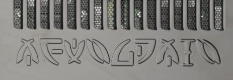
Since posting up some images way back in 2009, I haven’t really covered the (allegedly) ‘alien’ language claimed to have been stolen from a (fictitious) “CARET” research institute in Palo Alto by a mysterious Fortune City poster called “Isaac”. The whole lot was – in my opinion – nothing more than a Ufologist-trolling hoax (albeit one of the better-looking ones).
Starfire Tor
However, I recently found out that Isaac’s alien alphabet had (supposedly) been debunked by an online poster called Starfire Tor. She had noticed that the same font had been used by Alienware for a viral-style marketing campaign, based around a competition where breaking a ciphertext could have won you a trip to New York City worth $2800. Here’s what the ciphertext looked like (image from Starfire Tor’s website):
Alienware (which by then had been Borg-ed up by Dell Computers) also used the font to stamp “ALIENWARE” onto their promotional desktops (image also from Starfire Tor’s website):
For Starfire Tor, this was a slamdunk: a huge corporation like Dell would never (she reasons) just steal someone else’s font, ergo Dell/Alienware must have commissioned the font design in the first place, ergo they must have been (somehow) behind the whole Isaac/CARET thing. End of story.
However… take a closer look at all three versions of the alien alphabet, and you’ll notice they’re all slightly different. The competition alphabet contains four extra glyphs (plus a dash and a full stop) not in the Isaac alphabet: while the ALIENWARE stamped-out alphabet has one of the new competition glyphs (for the “A” in “ALIENWARE”) plus a unique reflected version of a glyph in the Isaac alphabet (the “E” in “ALIENWARE”). Additionally, the three alphabets all render the alien vertical bar glyph in different ways.
Hence it seems as though what actually happened was that Dell/Alienware just got their in-house artists to rip off the bloody aliens. (Presumably hoping that they came in peace, rather than with trademark attorneys?) So, even though I’m sure Alienware founder Nelson Gonzalez (who was famously a fan of all things ufological, hence his company’s name) would have loved to have been part of an alien conspiracy, I don’t believe that this was what happened (or else Dell would have just reused the existing font, right?)
Anatomy of an Alien (Alphabet)
In my 2009 post, I noted that it looked as though the alien text was made up of some letters, some numbers, and a few pieces of what seemed to be punctuation. I also complained that nobody had actually bothered to transcribe the alien text (presumably because going round in circles is a pain in the neck).
All the available Isaac CARET scans are online here, taken from pages 119 to 123 of a fictitious CARET book. Note that pages 120 to 123 are just zoomed-in versions of parts of the (larger) diagram on page 119, so there’s actually only a single diagram to work with.
Looking more closely, the alphabet contains a large number of apparent groupings, which suggest that a kind of “pigpen”-style glyph generation process might have been in play here. With that in mind, here’s my work-in-progress transcription key for Isaac’s alien alphabet:
It’s entirely possible that I’ve missed one or two really rare glyphs (the lettering is large in some places and tiny in others), but I believe that this covers just about everything that appears. (I’m reading all the strings clockwise.)
Alien Alphabet Transcription
Inevitably, I tried to use this to transcribe some of the text (in the middle of the “octal junction”, p.120):
FKRYRSAKML SBUN M HY
X2L R -JM EW1D DT-ED (345-521) BV-KA P6FKL (])
SHJD C-XEGYRI (DEB)
JMRI LAI-FELK GUHFVX (KLN) [
However, I have to point out that CryptoCrack wasn’t hugely impressed. But maybe someone else will have more perseverance and luck than me.


According to this website – https://surrealestate22.livejournal.com/208575.html – Alienware put out a letter denying that they created the Isaac alien font:
Hi ________,
Thank you for your email. It’s great to hear that our promotion has reach out to you and your Forum group regarding the CARET document. Alienware did NOT create the information regarding this phenomena or the CARAT linguistics. This is NOT an intellectual property of Alienware. The information has anonymously spread throughout the web for some time. We have taken the CARAT linguistics and have applied this as a marketing tool to draw attention to our promotion.
Regards,
Director of PR Communications
Alienware Corporation
Tel: 305-xxx-xxxx
The same font can be downloaded for free from http://www.iconian.com/fonts/zetareticuli.zip . The font comes in three versions: regular, italic, outline. It’s called Zeta Reticuli and the font files are dated May 24th, 2019. It would be interesting to know what inspired the font designer (Dan Zadorozny) in 2019…
Dario
PS: I am mostly a (rather faithful) lurker and have written a couple of comments on this site in the last ten years. Don’t confuse me with the commenter ”Darius” who is completely unrelated.